Issue 7 is just came back from Ka-Blam last week. It will take around three weeks to make all of the adjustments to the color, layout and copy before we send off another test print but there is no doubt that the final will be ready weeks before the convention season starts. That said, I had fun breaking down how the last cover was done so I thought I would revisit the idea again. So here goes.
1: I couldn’t find the thumbnails of the various compositions for this cover but most looked really close to this final drawing. I had it pretty clear in my mind that I wanted this gigantic ape blotting out the light from NPRS.

2:Spider-Man 229 was always in mind when designing this cover. While not one of my favorite covers, the composition lends itself really well to this foreboding juggernaut (pun intended).


3:The flats went in pretty easy but there was no visual punch to the image.

4: Adding a horizon line helped ground the figures but the gradient looked terrible in the print. Also the type needed a better treatment which got me thinking about some of the great covers that broke the headlines.
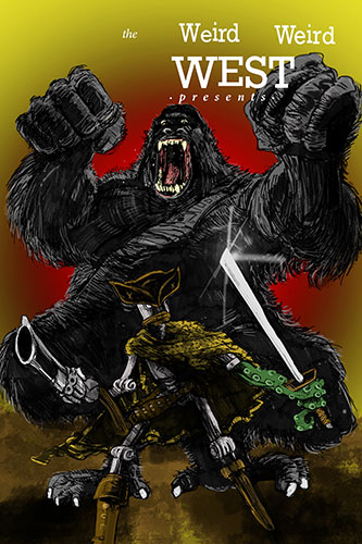
Such as..


5: Add this is pretty close to the finished piece. The colors are much closer to what I envisioned so hopefully that translates to the printed page. The half tone works well and the type for the most part is what I was aiming for. What does everyone think?
